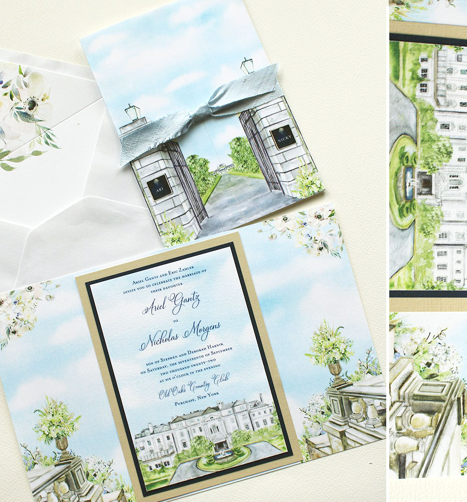
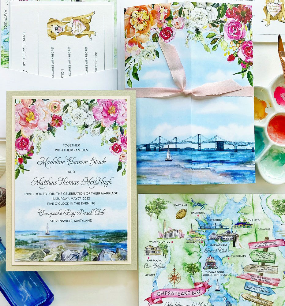
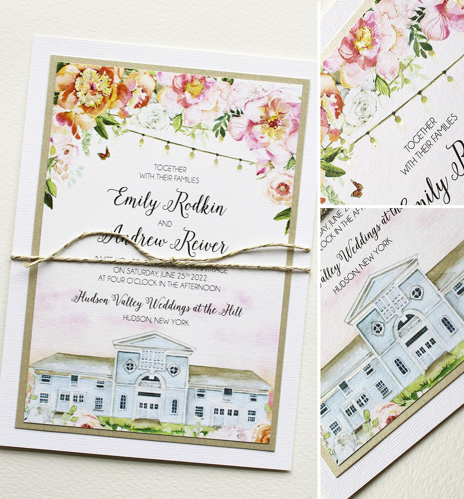
Many of you are very familiar with our Muddy Brushes gallery as it is the place where our most current projects are shared. It is the place where the real story of our artful designs are told. You have the chance to see where each design begins and ends with all the loveliness in between. We’ve created a community of sorts where each bride finds herself inspired by the next; drawing ideas for wording, unique paper combinations and artwork concepts.
The Momental Girls all have a unique voice and theirs are the food for much of the design thought you see in this gallery. Wouldn’t it be fun to see each week what Momental creation is inspiring the team the most or old favorites that have gone unnoticed? Yes, I think so. So I’ve decided to introduce a new post, exclusive to the Muddy Brushes gallery aptly named “House Favorites”. Enjoy!

This week I’ve chosen one of my go-to designs. Originally inspired by our Contrast Painted Collection where the lavish brushstrokes in milky tones on shimmer paper say it all. Nothing catches the eye quite like a heavily petaled peony, carved by brushstroke in shades of creamy white and pink. In places you see the gold paper peek through and in others, the white paints collects heavily and pool, reminding me of masters’ oil canvases painted with palette knives. Receiving a Contrast Painted Invitation leaves an unmistakable mark on the senses. You not only see the paint. You feel it… I love that.