My Best Friend’s Wedding – The Timeline Save the Dates!

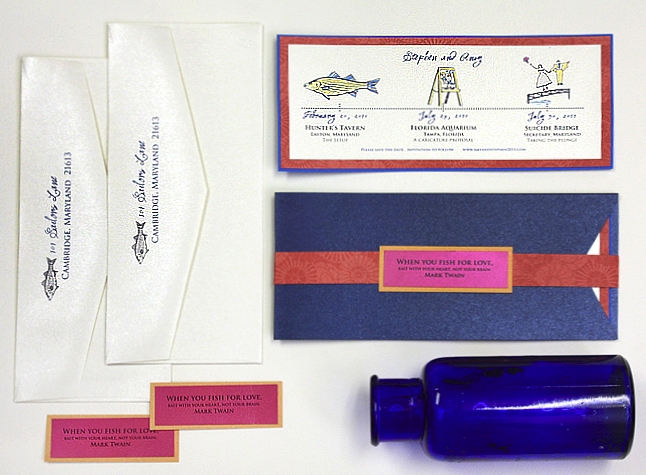
My Best Friend’s Wedding plans are back in full force and so are my posts to keep you caught up on all the planning adventures! Recently Amy’s save the dates left the studio in all their rich, colorful glory. You might remember that her Eastern Shore wedding is inspired by Classics of Literature like Tom Sawyer and Huckleberry Finn. The color palette draws from Amy’s unabashed obsession with vibrant hues and adventurous palettes while the whimsical spirit of the celebration began with Stephen’s crafty proposal at a Florida Aquarium!
Since Amy and Stephen’s story is so sweet, it deserved to be told. Our Storyline style save the date seemed perfect. We started with how they met, moved onto the engagement and then announced the wedding. Each point on the storyline was illustrated with telling artwork. You will notice the name of their wedding venue is Suicide Bridge which of course is a bit odd for a wedding celebration! The tongue in cheek fact though is that the namesake of this restaurant, a nearby bridge is no more than 10 feet about the water. We took a lighthearted spin and drew a dressed up couple taking a short dive into the water!

Each piece slid into an Envelopements® Portable Pocket inNavy to help balance the otherwise bright palette. Tiny tags boasting this quote were the first detail guests laid eyes on:
When you fish for love, bait with your heart, not your brain. – Mark Twain

A bit of turquoise was added…

Painted details in gold, turquoise and cobalt unified the Storyline artwork…Amy chose Envelopments Bloom pattern in Pout whose texture and shimmer is just divine. I am partial to this one as it is the same I used in our Renewal stationery!

We’ve already begun preparations for Amy and Stephen’s invitations. HINT: A teaser to their detail is in this post
Can’t wait to share more soon and introduce you to their photographer Danny Bostwick.
May 25, 2010
Ronke
Even though I have done this design before, it still seems new somehow!

We have done this design often but it looks brand new for you in this version!


Shimmer, shimmer!! I so enjoyed seeing this artwork in it’s full glory here!

I love the boldness of the chartreuse painted details!
I’m so excited to see the storyline work on the smaller format! I used shimmering eggplant and sage green border with a subtle gold printed layer.
February 16, 2010
Aaron H.
We tried a slightly different blue cardstock and experimented with repeating the sun logo but will also try just a detail!
Have I mentioned how much I love your color palette? The accommodation card below is an example of how we can incorporate the artwork from your save the date design!
I love the bold, striking blue against neutral gold. I added hand-painted touches in gold as well!
December 21, 2009
Tiffany G.
I am so excited about this landscape!
Bright and bold – sure to get your guests excited!


Welcome to the studio! My name is Kristy Rice and I work alongside six fantastic friends-artists-designers who help me bring the Momental Experience to Brides all over the world. I love custom wedding invitations, painting, paper and feel blessed to work in my studio each day. Each week I love to share studio happenings, my favorite projects, inspirations, diy tips and real wedding photos!


