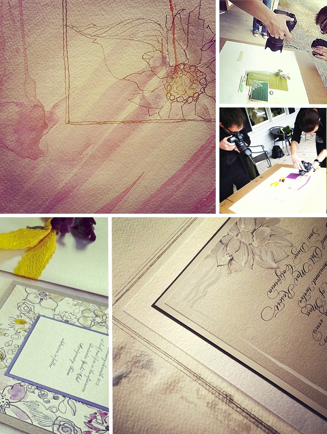
My Story is Art – New Collection Mini-shoot with Jillian McGrath Photography
Yesterday Katie and I were all tangled up in a painterly inspiration shoot of four new designs coming your way soon. I set out to challenge myself a bit with super clean styling, un-fussy painting and modern detailing. Bravo to Jillian and hubby for some of my favorite shots to date. They dove in and […]
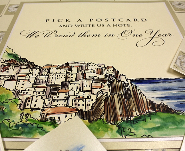
A Peek into the Studio – Art Deco, Positano Italy and Red Dahlias
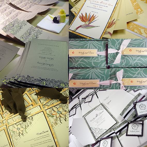
This week’s favorites from the painting table are a varied bunch. Each project holds so much sentimentality for its couple and family and we are honored to have brought these stories to life! First up is Leigh’s Art Deco inspired wedding invitation. A few photos of family heirlooms from Leigh are all we needed to […]
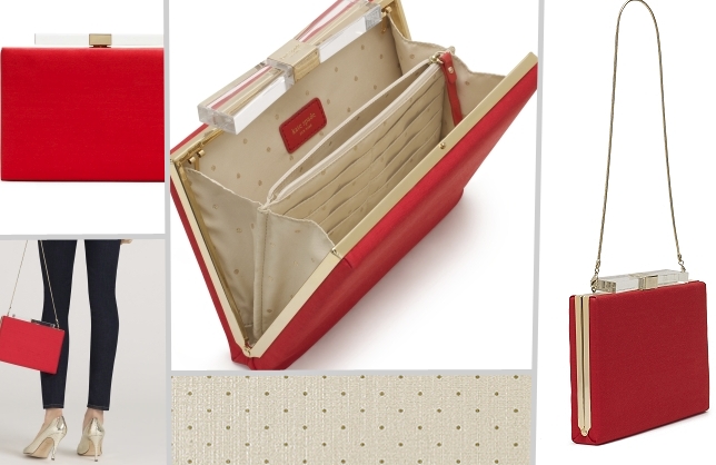
Inspired Ink – Invitation for Kate Spade's Candy Darling Bag
Earlier this week I shared the 2010 Momental Gift Guide and today after swooning the entire week decided to create an invitation inspired by this lovely bag by one of my favs, Kate Spade. Iconic shapes, delicate patterns, unexpected materials and saturated color use are hallmarks of this fashion icon’s designs. Who wouldn’t be inspired? […]
Inspired Ink: A Tim Burton Wedding
Every once and a while I meet with clients face to face. It is a special joy for me since so many of our clients live here, there and everywhere! I had the privilege to meet Jessica and her fiance recently and needless to say their wedding palette was heavily inspired by Tim Burton imagery. […]

Inspired Ink – Mexican Otomi Fabric
This week’s Inspired Ink post evolved out of a simple Twitter conversation that transpired a while back. Annemarie from Perfect Bound “tweeted” this colorful headboard project courtesy of Design Sponge. Here is what she said: and then me…. and so the challenge was born… Headboard The simple pattern instantly reminded me of Matisse’s later cutout […]
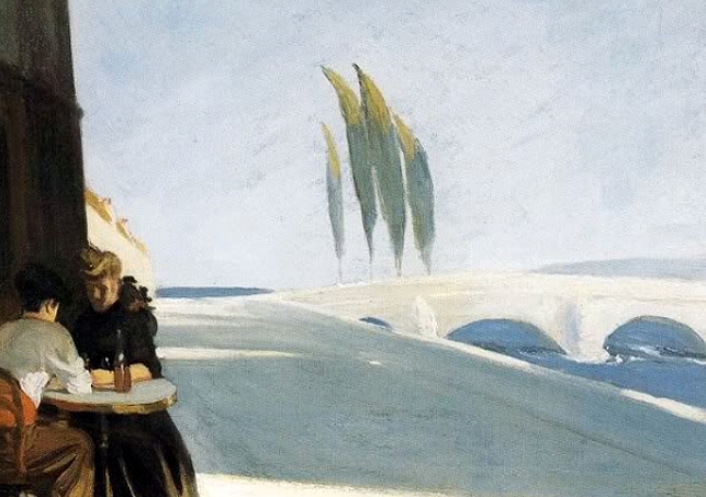
Inspired Ink – Edward Hopper
Inspired Ink posts were originally begun on my blog in 2007. This past summer I began blogging for Weddingbee PRO and decided to share my Inspired Ink posts with the PRO audience. As I am sure many of you know Bee Kim, founder of Weddingbee.com recently gave birth and thus decided to put Weddingbee PRO […]
Inspired Ink – New look, new photos part II
Layers of watercolor paper proved to be the perfect backdrop. Black, yellow and white – yum! Pretty papers fresh from our travels to the National Stationery Show. Shane sent these to me late last night – I am just thrilled. I really love how he captured the hand-painted details on Shea’s unique wedding announcement.

Inspired Ink – Suspended Orchids
I explore Karen Tran’s blog and website almost daily and each time I visit I notice something new. I fell for her suspended orchid centerpiece creation – the graceful shapes, crisp color and glistening details are just breathtaking. For this week’s Inspired Ink post I created a Cascading Vintage Lacy design in shades of ecru, […]

Peacocks, Willows and Eventology – The Collaborative Process
One of the most exciting parts of my design days is when I have the chance to collaborate with other vendors. Recently I created items for 2 events. Randy from Wicked Willow noticed my stationery pieces and the I DO Brunch last month and contacted me to create several items for a 18th Annual Great […]
Inspired Ink – Cherry Blossoms, Ocean Waves and Pearl Posies!
It has been another busy week for the Momental Girls. Pictured here from left to right are a few of our favorites: Phoebe’s hand-painted yellow blooms on gold shimmer cardstock, Amy’s grommet style pocket invitations, Jody’s Petal menus, Misty’s Vintage Lacy Ocean Inspired Tree, Kris’s Posies with taupe brushstrokes and last but not least Regan’s […]
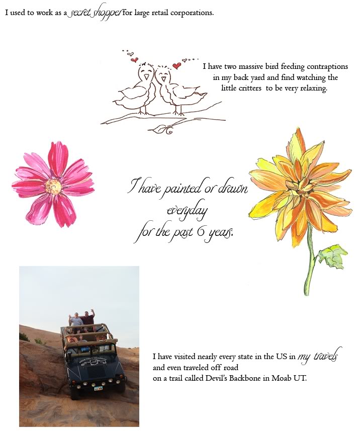
10 things about me.
I thought this might be fun…here are 10 random facts I wanted to share. Comment if you like – but be nice 🙂

Inspired Ink – A look into the Momental Studio Part II
It is yet another busy day in the studio for the Momental Girls. Everyone was so quiet today – diligently working on Susan’s, Elana’s, Karen and Kirsten’s orders. I just had to liven things up and what a better way than some candid shots of our invitation painting in progress. The Momental Girls from left […]