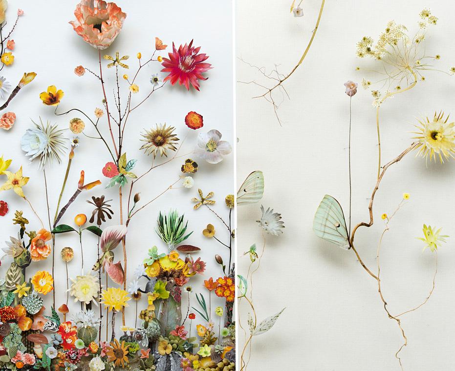
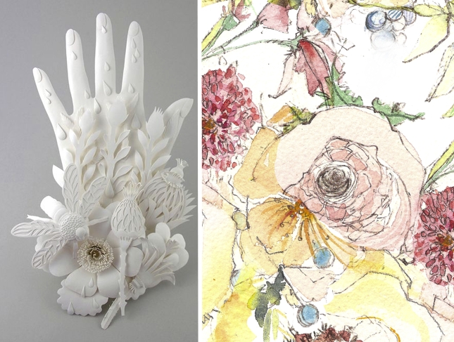
Inspirations – Anne ten Donkelaar’s Flower Constructions
Mixed Media artist from the Netherlands, Anne ten Donkelaar calls her creations Flower Constructions. I had to think on that phrase for a bit because as I have discovered, words, and how they make me feel have a big impact on my perception of things. So the word “Construction” didn’t seem to at all give […]
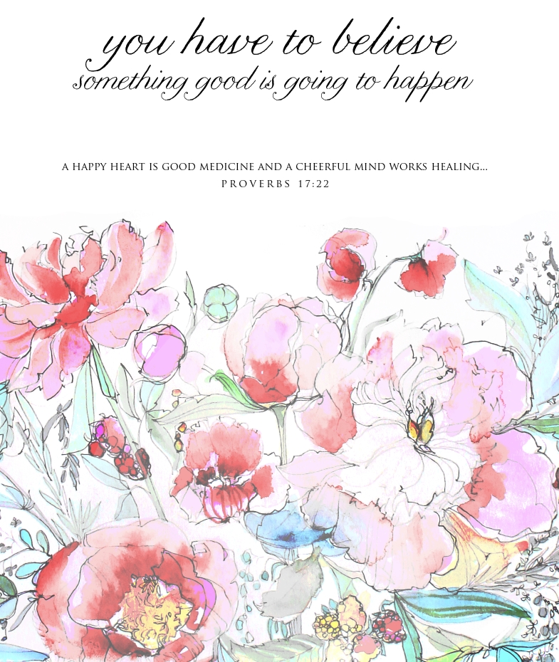

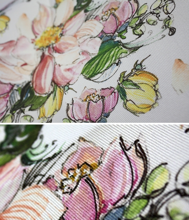
Inspirations – Spanish Inspired Floral Pattern in Watercolor
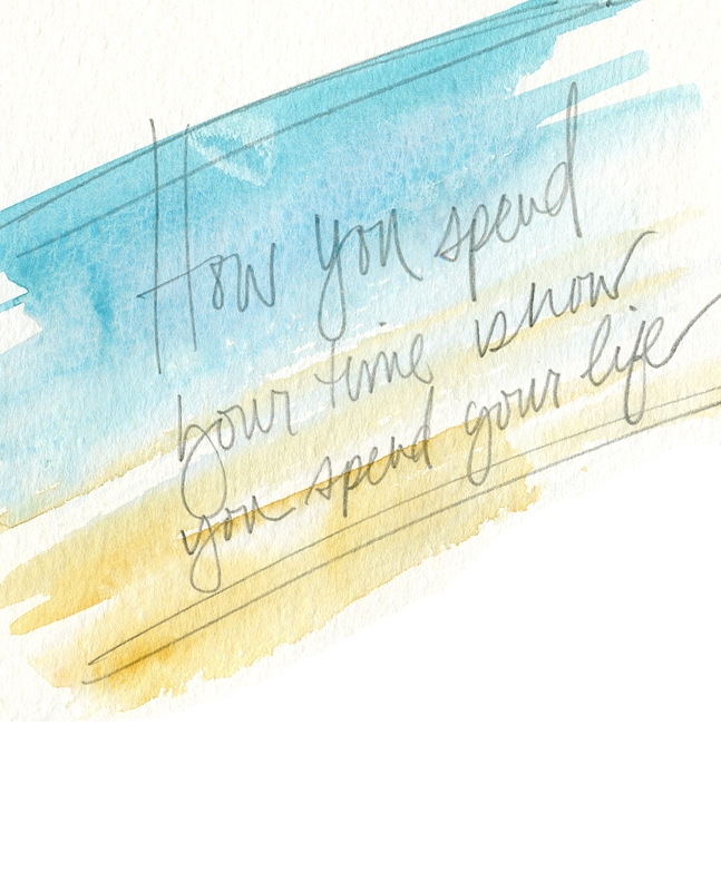
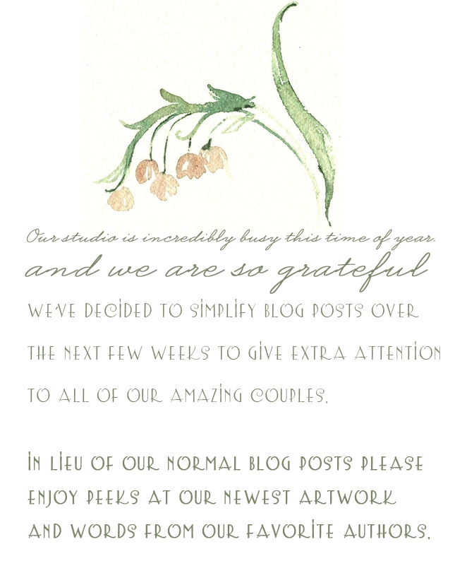
So why this simpler blog post you may be wondering? Read why here. Want to see more, head here.
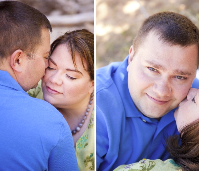
Inspirations – Thankful for Adam
The Holidays bring out a certain nostalgia, of course, don’t we all feel it at some point? Friends on instagram and twitter have been sharing daily thankful thoughts this month and I wish I was doing the same. Stopping this morning to think about what I’m thankful for translated into this, I’m afraid, very sentimental, […]
Inspirations – On Being Literal…
In the studio, the word literal has no shelter. In my world, the stuff of making art, creating impressions with something tactile like paint requires a need for embellishment both literal and figurative. We strive to paint a picture of our couples’ love everyday without necessarily painting the whole picture. Do you know what I […]
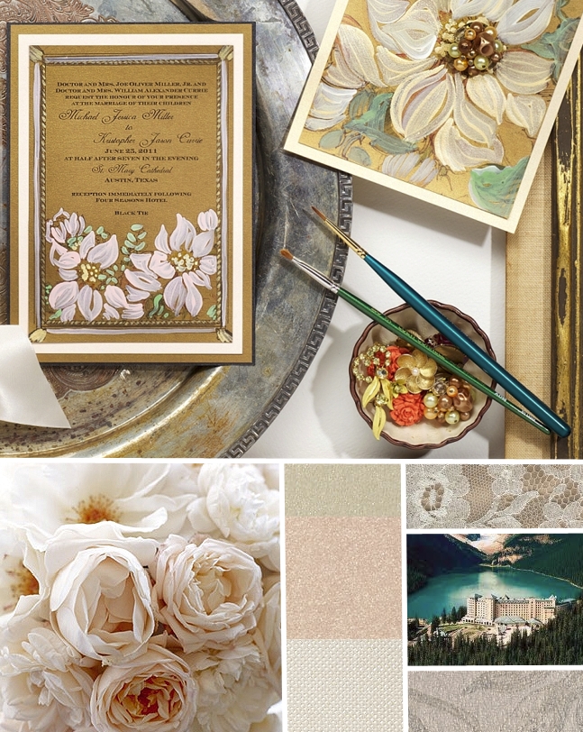
Inspirations – Fairmont Chateau Lake Louise Wedding Invitations
With an awe inspiring venue and blush peonies as their muse, this couple’s invitation will surely be delicately painted with a sophisticated flair. Fairmont Chateau Lake Louise, Papers, Blush Peony Handmade Wedding Invitations, Blush Peonies
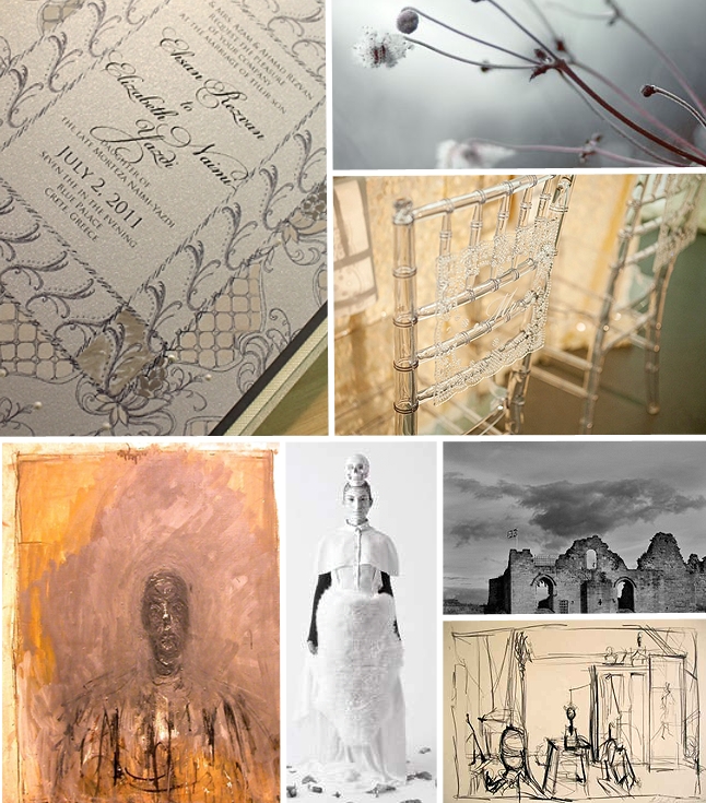
Inspirations – Alberto Giacometti and The Ghostly Celebration
Alberto Giacometti was first introduced to me in college by a professor who likened my figure sketches to his. At the time I was a bit offended as I saw Giacometti as dark and messy. Over time though, I gained an appreciation for this artist’s deconstructed figures and the elegance of his sketchy hand. Today […]
A Peek into the Studio – Paints, Palettes and Projects
Sometimes a simple act can lead to big things. So I attribute my new watercolor palette to a lot of the gorgeousness going on at the studio as of late. Call me crazy but nothing inspires me more that a white sheet of Arches and a palette full of fresh, new watercolor. Soak it up. […]
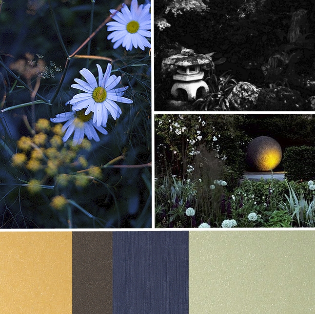
Inspirations – The Twilight Garden
Twilight daisies, Night Garden, Twilight Garden If any of you follow my tweets you may have heard that our July 4th was a big one. The hubby’s been prepping fireworks for our big bash since March, yes, March! As I sat and watched the colors explode in the sky I also noticed how the light […]
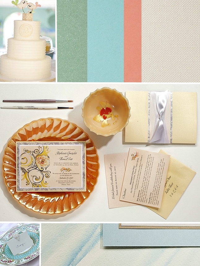
Inspirations – Mint, Aqua and Coral Watercolor Wedding Inspiration
This palette of freshness makes me smile…paired with lovely ivory tones the look is whimsical and clean with a modern twist on a classically elegant vibe. Sweet Bird Cake, Patterned China, Papers, Versailles Swirl Wedding Invitation, Watercolor Wedding Invitation