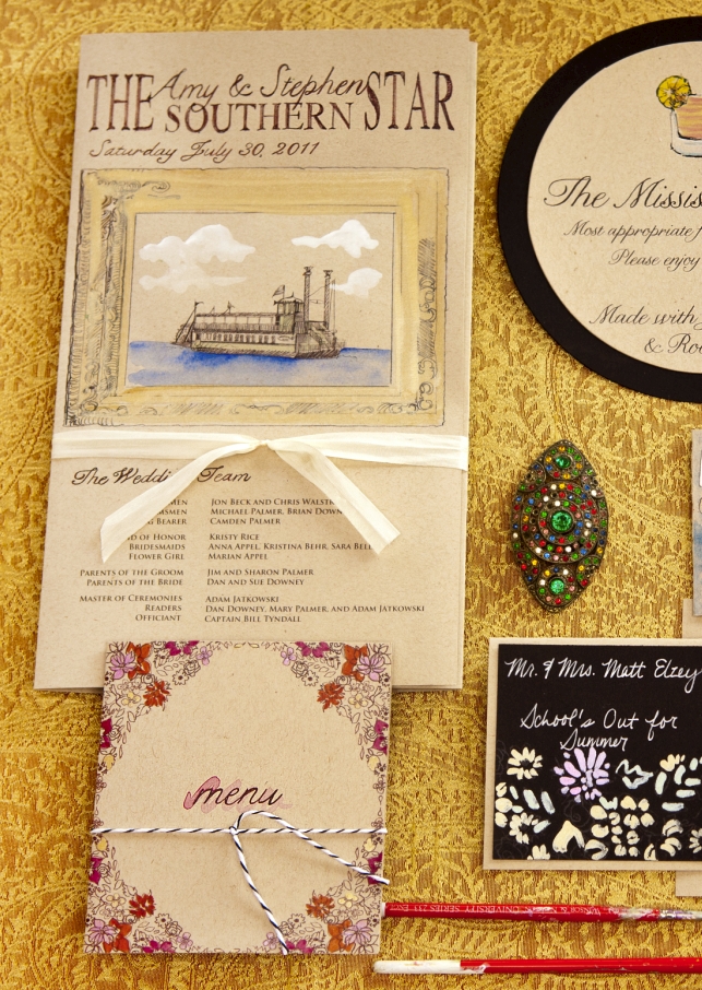
My Best Friend's Wedding – Amy and Stephen’s Vintage Riverboat Wedding Part II
So I’m back to dive in deeper to the stationery I created for My Best Friend’s Wedding. I warn you, I took every opportunity to express myself and this couple on paper so there is no shortage of painted paper detail here. The save the date was all about introducing guests to #1, the bold […]
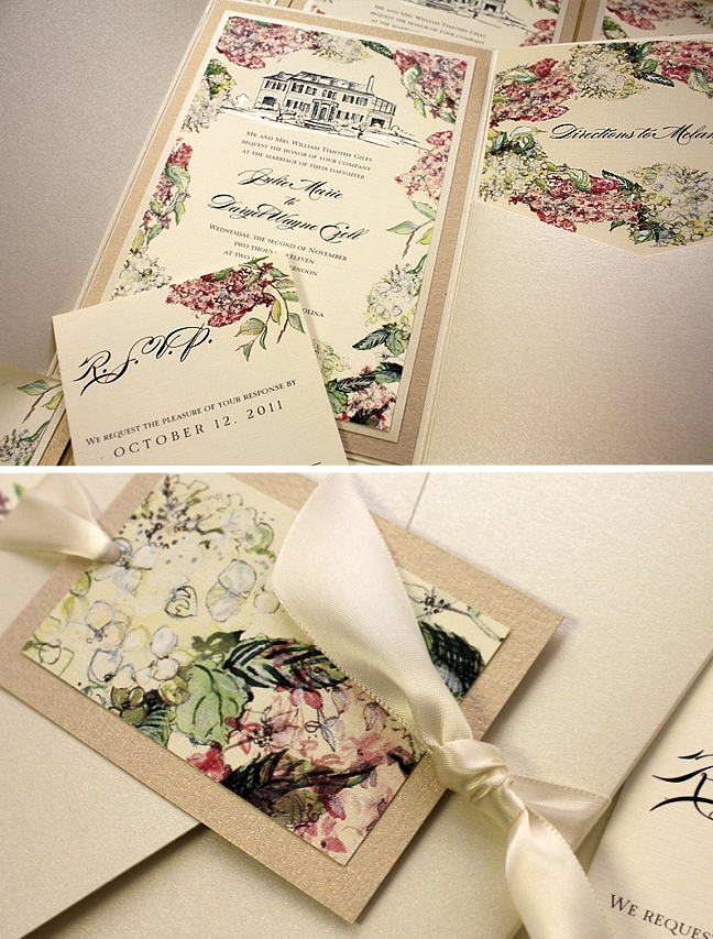
A Peek into the Studio – Hydrangeas, Garden Roses and Vintage Frames
Happy Birthday to me! Feeling like I’m surrounded by the prettiest presents ever today since The Momental Girls have been painting their hearts out this week! Seriously though, I am feeling quite blessed today especially as l look around the room and dig into photos from our most recent projects. We have come a long […]
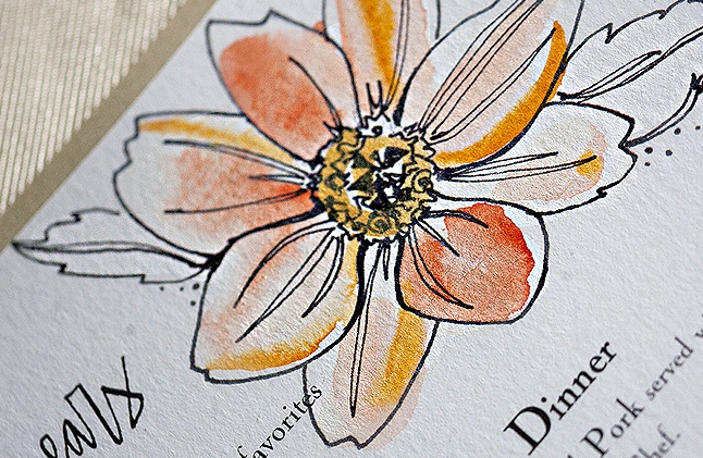
A Peek into the Studio – Painted Wood and Watercolors
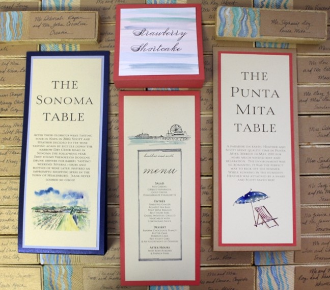
When I first met Heather I instantly knew she was the perfect client. With a love for watercolors and a heart for travel, we had so much to draw from when sitting down to design for her wedding. Heather’s celebration unfolded near the ocean so we created a suite of artwork to communicate their love […]
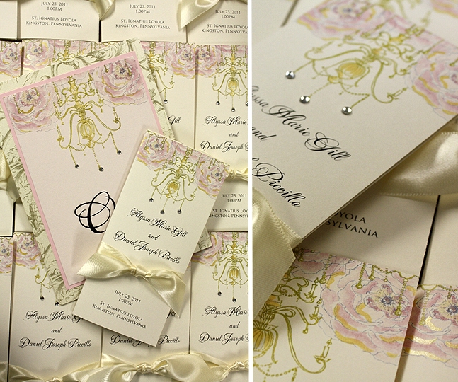
A Peek into the Studio – Chandeliers, Hydrangeas and Bougainvillea
The studio is bustling with ideas and projects this time of year. We love the variety of mid-summer, everything from blooms and feathers to venue sketches and snowflakes are on the painting table! I pulled a few favorites from the last week to share. First up is Alyssa’s cheerful and elegant day-of accessories. Custom wedding […]
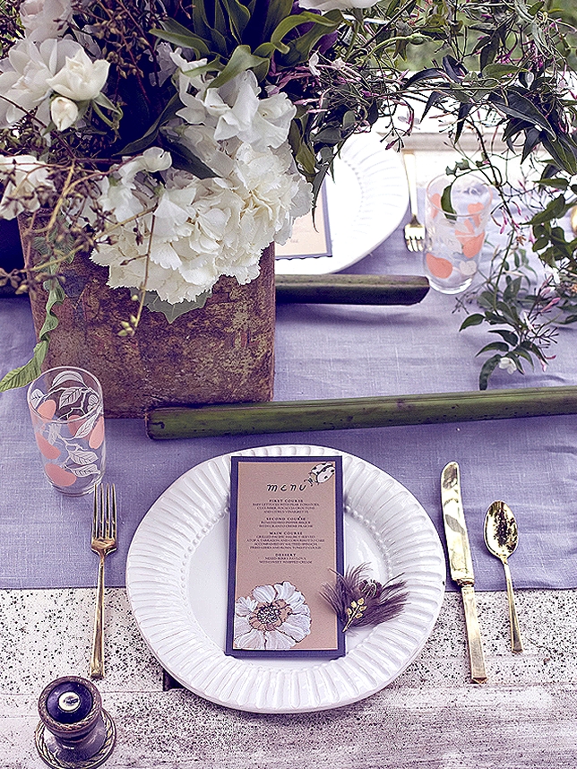
Behind the Scenes – Alchemy at the Barn, The Stationery and Feathers
Thanks so much for following along my behind the scenes look at my Alchemy at the Barn shoot. If you missed the first two posts, check here and here! Creepy was a word that continually entered my mind when designing this table. I know, I know…creepy…for a wedding concept? Something Colin Cowie said at Engage […]
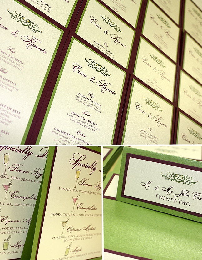
A Real Momental Wedding – Erica and Ronnie inspire a unique wedding color palette!
Erica and Ronnie were married last September, but I have been waiting for the perfect time to feature their stunning affair. Their palette of pomegranate and chartreuse is both bold and elegant with an eclectic spin on color pairings. Picasso callas and Green Cymbidium orchids are just a few of the floral elements that brought […]
Renewal in PA Part III – The Favors, Cake and Stationery
For the next installment of our Renewal in PA posts, I am sharing more today about our candy favors, Sylvia Weinstock Cake and the stationery by yours truly! Have a look at previous posts here and here to catch up on all the detail! A big part of our vow renewal planning process involved collecting. […]
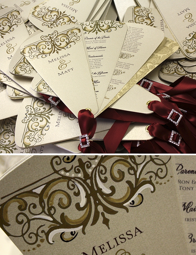
A Peek into the Studio – Buckles, Swirls and Rhinestones
Melissa is getting married this coming weekend and the Momental Girls could not be more thrilled. We will miss her sense of style and kind words as she has been a pure joy to work with over the last few months. Her invitations were epic, in my opinion at least! From gorgeous silk textures to […]
A Peek into the Studio – An Artful Celebration at Saddlerock Ranch in Malibu, CA
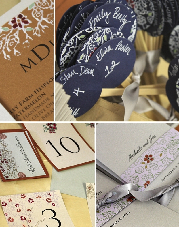
Michelle got in touch months ago after seeing this feature on Green Wedding Shoes. Our Vintage Lacy Tree Collection caught her eye and was the perfect way to introduce guests to the Saddlerock Ranch in Malibu, CA, where all the wedding festivities will be held. As Michelle’s design evolved, so did her enchanting color palette. […]
Press – Momental on Merci New York
Aleah from Good Life Events called me one day earlier this year with a lofty idea (aren’t those the best kind?). A marathon day of six wedding shoots was planned and she wanted me to create all the custom stationery to coordinate. I was immediately intrigued and knew my creative muscle would be challenged since […]