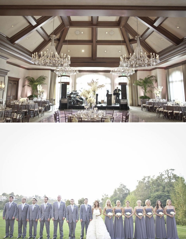
Beth H.
So excited, love the textures of the gold painted details and of course the hand torn edge…

December 23, 2010
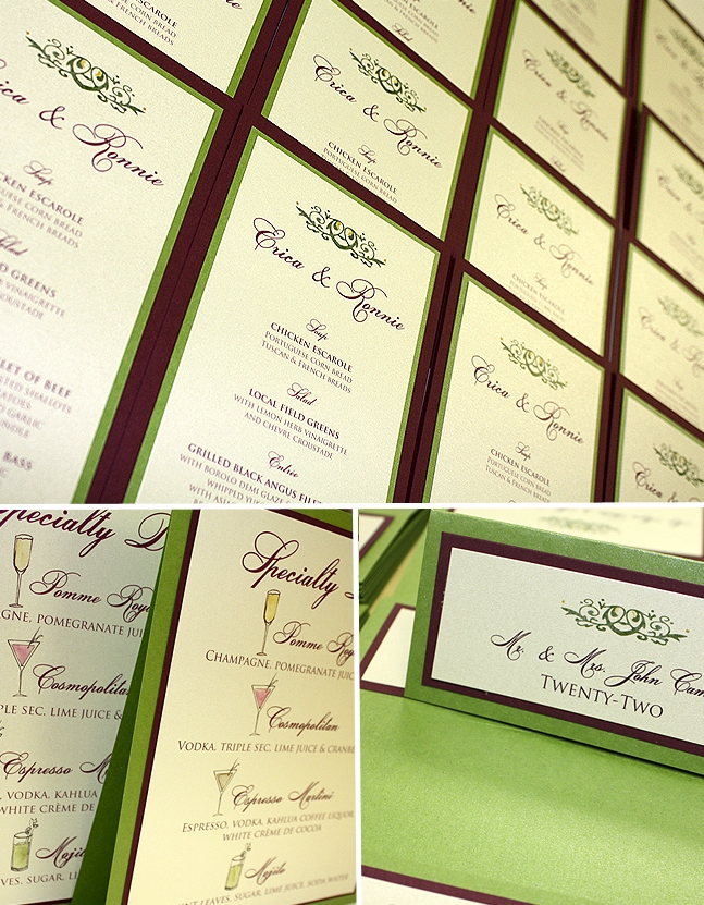
A Real Momental Wedding – Erica and Ronnie inspire a unique wedding color palette!
Erica and Ronnie were married last September, but I have been waiting for the perfect time to feature their stunning affair. Their palette of pomegranate and chartreuse is both bold and elegant with an eclectic spin on color pairings. Picasso callas and Green Cymbidium orchids are just a few of the floral elements that brought this event to life! Palm leaf chair design for the head table introduced the fresh grassy green as seen throughout her stationery. It is these small details that can transform an ordinary celebration into one that is remembered for years to come!

Kristin Spencer captured the amazing shots seen here, love her work!
In their stationery we balanced a bright grassy green with a shimmering eggplant. Erica’s planners Lynell and Stasia of Exquisite Events in Newport, RI collaborated with us to craft seating cards, menus, table numbers, hand illustrated drink menus and various other small signs. Simple scrollwork and painted dots in gold adorned each piece. The custom drink menu featured watercolor illustrations of Cosmos, Mojitos, Expresso Martinis and Pomme Royal Champagne!

A special thank you goes to Lynell and Stasia from Exquisite Events for always introducing us to the loveliest Brides. We so enjoy working with you ladies and always look forward to our collaborations each year!! Merry Christmas!
November 8, 2010
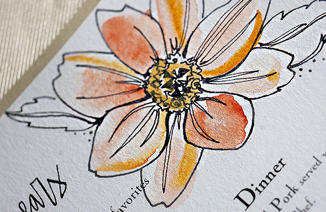
Renewal in PA Part III – The Favors, Cake and Stationery
For the next installment of our Renewal in PA posts, I am sharing more today about our candy favors, Sylvia Weinstock Cake and the stationery by yours truly! Have a look at previous posts here and here to catch up on all the detail!

A big part of our vow renewal planning process involved collecting. Some of my fondest memories in planning grew from the many trips we took as a family hunting down depression style glassware, old sour cream glasses and linens to use throughout the celebration. My Nana had a good sized collection of vintage sour cream glasses from years past that she would actually use day to day. I remember fondly drinking from the brightly colored glasses adorned with bold blooms and intricate patterns. I found the prices to be reasonable, most often at about $1.00 per glass and thought they would make the perfect favor for our guests. We chose classic root beer barrels, caramel creams and white nougat candies as the sweet filling for each glass. Strips of graphic wallpaper (the same used on our photobooth backdrop) secured the candy in each glass. A small tag printed on our signature watercolor effect paper was fastened with the cutest yellow and white baker’s twine from Bake It Pretty! Betsy Dunlap created a digital version of our names and as you will see, we took full advantage of her artistry throughout the event.

Perhaps the single most exciting part of the vow renewal planning was designing my cake with the fabulous Sylvia Weinstock! Based on my watercolor sketches from trips to Utah and a watercolor painting inspired by Sylvia’s iconic sugar peonies, this masterpiece came together just as I had envisioned. Curious to see the original sketch , read about our first meeting or perhaps the story behind the design? My beloved Clara French cake pedestal was the perfect home for Sylvia’s creation. Each of these stands is hand glazed to lovely imperfection. What I mean specifically is that each creation is one of a kind with the glaze dripping differently on each piece. A huge thank you to the team at Clara French for taking my very last minute request!

The stationery for the event was admittedly simple. Without too much fuss, each piece was mindfully crafted to capture the color, texture and mood of the celebration. Gold shimmer stocks, Betsy’s lovely text, black velvet detailing and punchy dahlia blooms all combined to create a pretty palette of hand painted paper goods. Our menu was served in stations with some passed goodies. Each guest menu was painted using various shades of orange watercolor flooded together. Touches of gold shimmer ink were placed into each petal when wet creating an explosion of color when dry.


Each table featured this fun card wrapped with a vintage hanky and black velvet ribbon. Fun facts about The Cottage, information about the evening’s events and an open invitationt to explore the 3 floors of the old structure were all included.

Remember our Zane Gray altered book invitations?
Thanks again to Daniel for all the gorgeous photos. The next and final post is all about our photobooth!
September 16, 2010
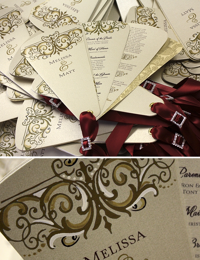
A Peek into the Studio – Buckles, Swirls and Rhinestones
Melissa is getting married this coming weekend and the Momental Girls could not be more thrilled. We will miss her sense of style and kind words as she has been a pure joy to work with over the last few months. Her invitations were epic, in my opinion at least! From gorgeous silk textures to heavily painted swirls, the finished look is still talked about at the studio and by the couple’s guests. That feels good to say the least. When Melissa came back to me for her day-of accessories, I was truly honored and admittedly crazy excited to revisit her design!

Each group of petals was adorned with a tiny rhinestone buckle and a long length of satin ribbon. Painted swirls and dots in shades of ivory and gold add to the vintage look with their imperfect yet lovely application.

Menus will peek out from a folded napkin at each place setting. Melissa’s linens, table tops and chair covers are all custom designed exclusively for her event so each element was designed to compliment perfectly.

These simple table numbers encrusted with individual rhinestones were crafted with hand painted wooden sticks to perch on a flower display.
So what am I up to?
Just wrapped on a top secret project with some favorite people in the industry.
Looking forward to seeing old and new friends in just under 3 weeks at Engage10 in The Breakers!
Feeling incredibly uplifted by Lara Casey’s Posts lately and and waiting rather impatiently for V3 to hit newsstands!
September 1, 2010
Melissa W.
I created the petal program with a rhinestone buckle detail – so gorgeous!!

I adore this collection! The table number has a lovely profile (skinny and tall). I added the large rhinestone buckle. Each piece features varying painted details for added interest. I created a petite fan program that is sophisticated and functional.

I am not sure how I would even decide but the buckle version is soooo pretty!


This look is all about texture, organic shapes, vibrant pops of color. The two damask patterns could be re-drawn with slimmer, more graceful, sletchy lines, but I do love the feel in general.

Gold Damask, Red Damask, Chandelier Reception Card, Beaulieu Garden, Bride, Paper Swatches, Silk Folio Invitation
I had a blast with this! A new damask illustration was created then painted in shades of red, gold and creamy ivory. The double layer buckle adds a vintage flair and loads of texture and personality. The folio is a rich chocolate but can be made in custom shades of gold like discussed.

August 27, 2010
Stacey
I chose a swirling script and simple leaf spray artwork painted with touches of ivory ink!

August 18, 2010
Katie S.

I am thrilled to see this look come together!

This is coming together nicely, right? The Pocketfold is just the right amount of fussiness.

Welcome to the studio! My name is Kristy Rice and I work alongside six fantastic friends-artists-designers who help me bring the Momental Experience to Brides all over the world. I love custom wedding invitations, painting, paper and feel blessed to work in my studio each day. Each week I love to share studio happenings, my favorite projects, inspirations, diy tips and real wedding photos!


