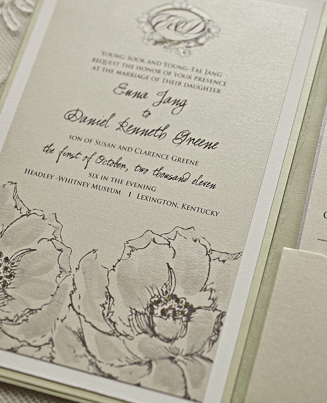
Our 10 Favorite Romantic Floral Wedding Invitations
As our days grow shorter and the cool air begins to sneak in, the last blooms of summer are unfolding in the garden. My mind instantly goes to the romance of the season. A theme translated many times over, often with a soft palette and delicate florals. A few of our favorites from the classic […]
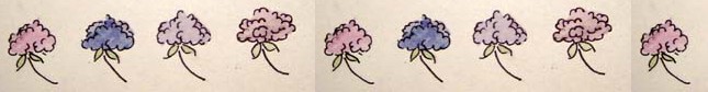
Hydrangea Wedding Invitations
What seems like forever ago I created the very first Momental Hydrangea Wedding Invitation for Kelley, my fabulous managing assistant. The artwork was small and stunning and seemed to inspire a continuing interest in this lofty bloom from that point on. The first Momental Hydrangeas as created for Kelley. This past Tuesday Kelley and […]