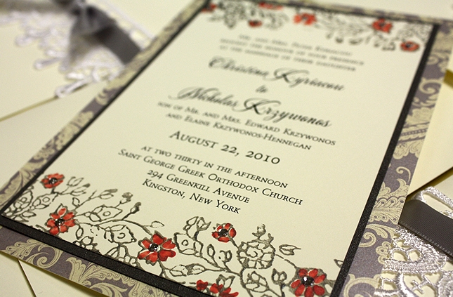
A Peek into the Studio – Lace Wedding Invitations
Oh how I love this invitation suite. Several months ago I purchased some laces, just to play and here we are. My “playing” often leads to a stationery project that I may never have dreamed could work but for Christina, it certainly did. The two varieties of lace acted as a closure along with the […]
A Real Momental Wedding – Sheri and Tom's Yosemite Wedding Part II
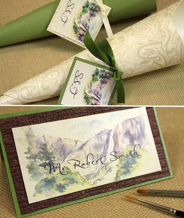
I heard from Sheri yesterday and she said “looking at these photos makes me want to get married all over again.” I love that. Gorgeous room at The Ahwahnee Hotel. Awaiting some professional shots from Patrick Pike, my snapshots of the seating card and cones will have to do! This shimmery bark-like paper appeared throughout […]
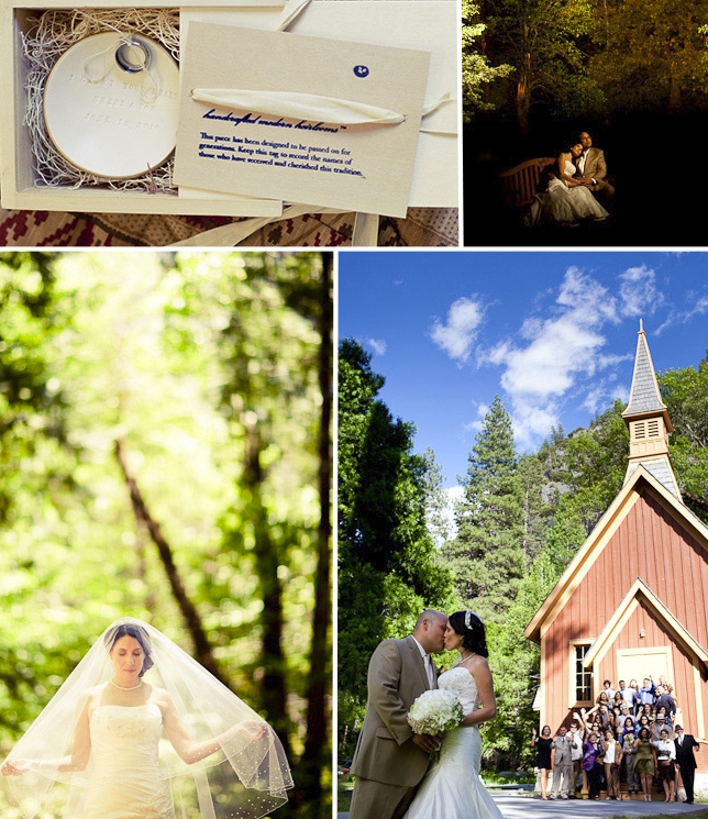
A Real Momental Wedding – Sheri and Tom's Yosemite Wedding Part I
When Patrick Pike sent me a sneak peek at client Sheri’s Yosemite Wedding I was floored. Having visited and painted in Yosemite countless times I was eagerly anticipating a look at Sheri’s wedding to see how the majesty of this place posed as a backdrop for her day. Really few words are necessary so I […]
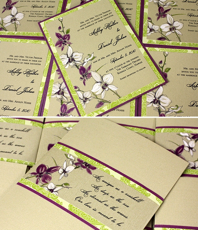
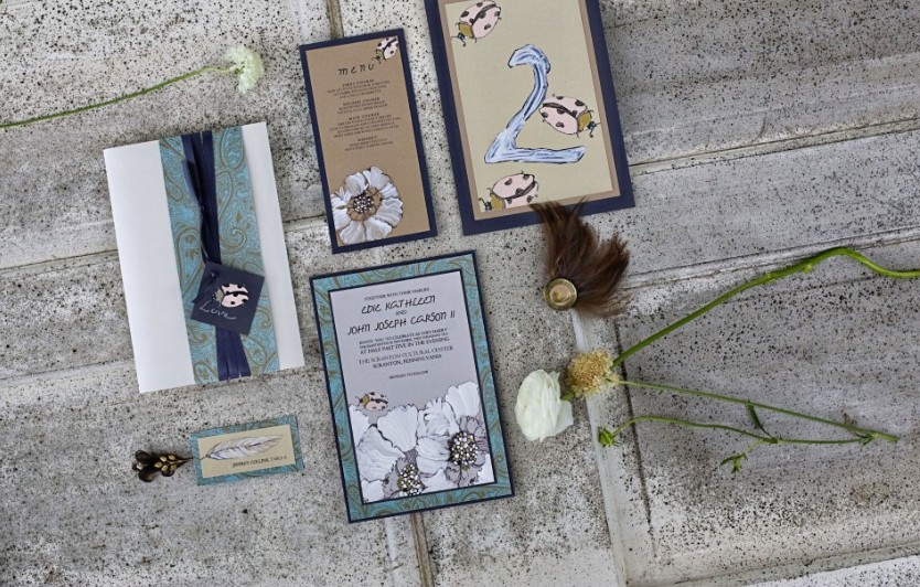
A Peek into the Studio – Orchid Weddings
This week is all about orchids. Similar artwork is used in both designs but wow difference a few colors and brushstrokes can make!
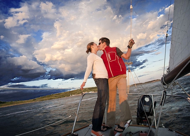
Inspirations – A Sailboat E-Session
You all know how much I respect my photographer friends, right? There is something so pure and magical about the ability to stop time, essentially crystallize an emotion and that is what I feel is at the heart of a powerful photograph. I found this image here and simply could not stop looking. I want […]
Engage!10 Recap Part II – The Sketches
The Engage Symposiums are mindfully crafted to never be short on style or detail. This year was no different. To put into words my appreciation for Rebecca and Kathryn, is difficult…thank you just doesn’t seem to cut it. Our industry is brighter, more savvy and stylish, stronger and more ready to face shift (thank you […]
Engage!10 Recap Part I – The Stationery and Sylvia!
What I love most about this industry are the people and dynamic nature of the business….we create new, beautiful and meaningful everyday (or at least strive to) and for this I feel grateful to even be a part. Over the next week I will share my view of the life changing time I experienced at […]
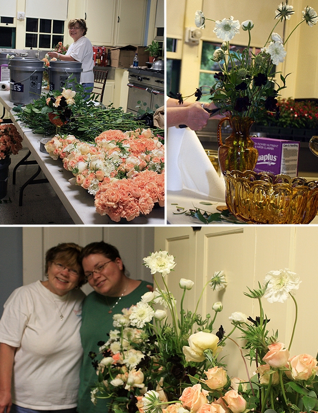
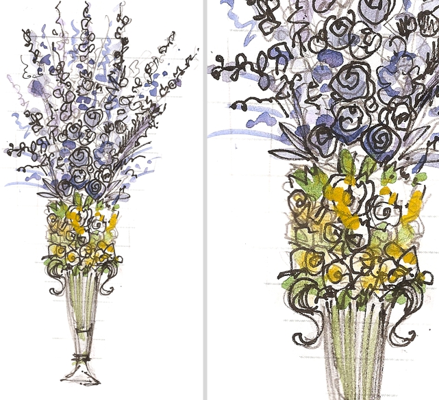
Sneak Peek: Renewal Flowers and Thanks Mom!
I needed to take a moment this week to thank my Mom. The words thank you hardly communicate how much I adore and appreciate her. As most of you know we decided to take the DIY route to create the Renewal flowers. With the help of FiftyFlowers.com and a lot of sweat and creativity we […]
Inspired Creations Contest – Vote for us!
I am so thrilled to finally be able to share some images from my Alchemy at the Barn shoot with Daniel Lanton, Metro Gypsy and Central Park Flowers and La Tavola Linen! This shoot was a contest submission for the Inspired Creations contest sponsored by Elizabeth Anne Designs and The Sweetest Occasion. Here are a […]

Inspirations – Magical Seaside Bride and Groom
I am slightly obsessed with the work of Jenny Llanes lately and this shot is exactly why. Just soak it in. Happy Monday!
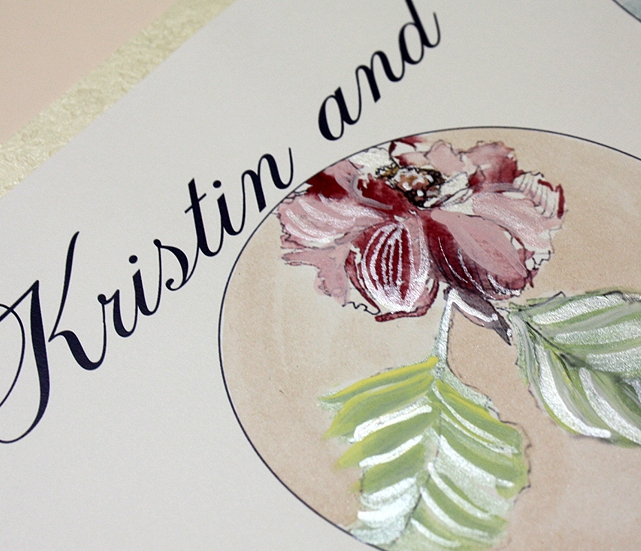
A Peek into the Studio – Custom Timeline as Reception Decor
I just had to share this fun project we just wrapped up for Kristin who was married two weekend’s ago. Her stationery collection is top secret as it may make an appearance in print sometime soon. In the meantime I can share this oversized timeline artwork we created for display on her escort card table. […]
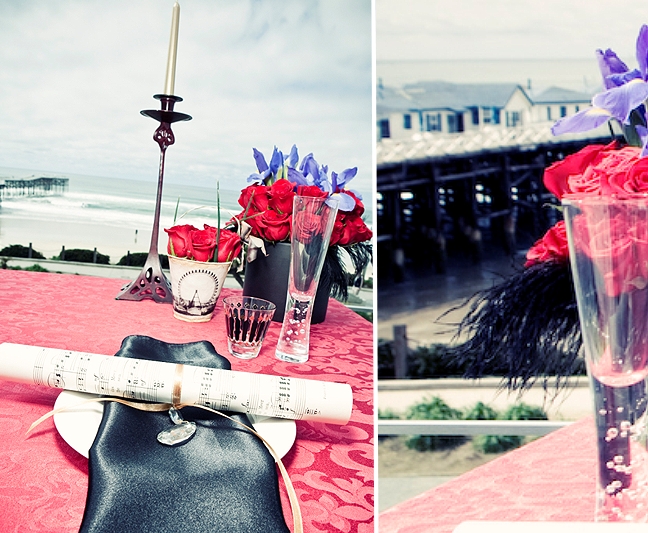
Press – A Rock and Roll Tablescape with Good Life Events
Here is a look at the Parisian Super Glam tablescape I contributed to this past February, recently featured on Rock and Roll Bride! Super saturated reds painted onto shimmer bright white cardstock packed a visual punch against the patterned linen. I love these little Ferris Wheel paper flower cups, so sweet! The juxtaposition of rock […]