A Peek into the Studio – Spring is here!
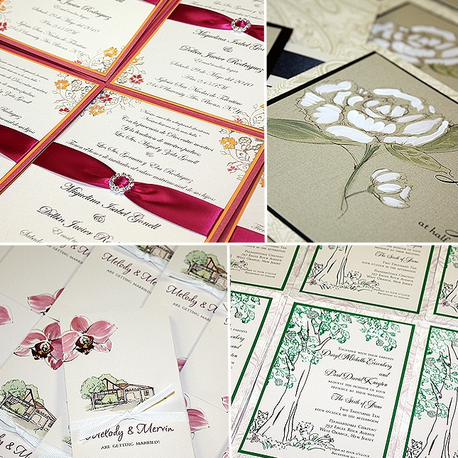
It has been a while since I have given you a peek into the studio. We are swamped and LOVING every minute of it. Client projects are shipping daily and I think we owe our UPS guy a massage gift certificate. The seasons pass before our eyes each year with our invitation designs as […]