Out and About – A Renewal in Zion
Greetings from the Philadelphia International Airport where I am about to board a plane (with Mom of course too) headed for Las Vegas. This trip has been a long time coming as our renewal plans have been in the works since Christmas of 08. It is hard ot believe the hubby and I are finally […]
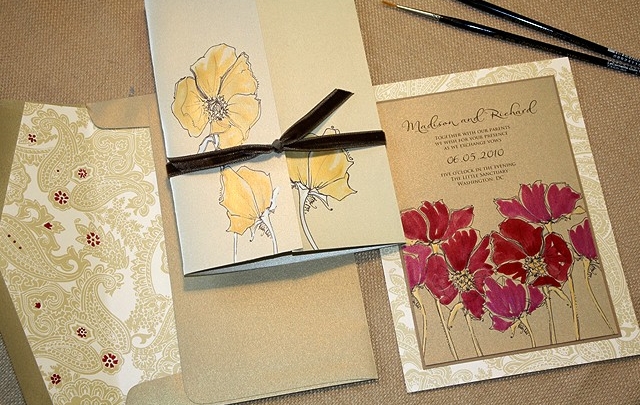
A Peek into the Studio – Petals, Peonies and Hydrangeas!
Flowers are blooming like mad here at the studio. From bold, graphic patterns to lush romantic bouquet style illustrations, we cannot get enough of this garden inspired subject matter! Two projects in particular were the talk of the studio this week. Kate’s Vintage Petal Pattern in shades of aqua, fuchsia and pale yellow were a […]
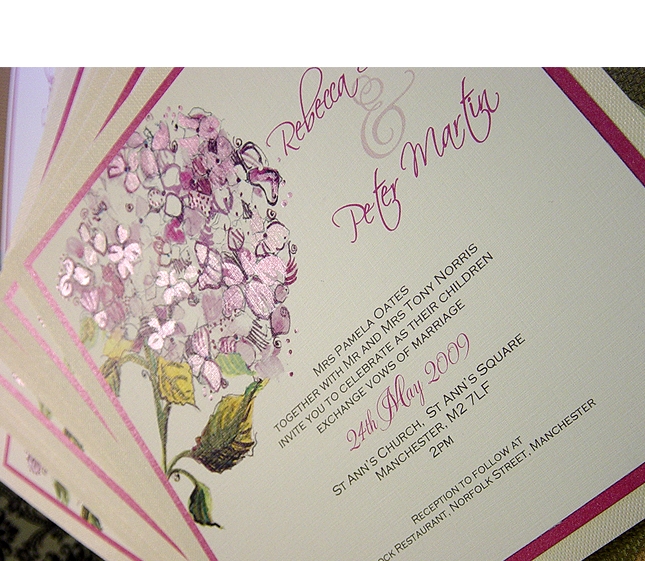
A Real Momental Wedding in the UK with Pink Hydrangeas
Rebecca chose from our Big Blooms Collection and asked specifically for a Pink Hydrangea to be hand painted for her wedding invitation design. Her pieces were printed on a gorgeouslly textured linen stock that showcased the shimmering pink hand painted strokes of color perfectly! We asked Rebecca to share a bit with us about her […]
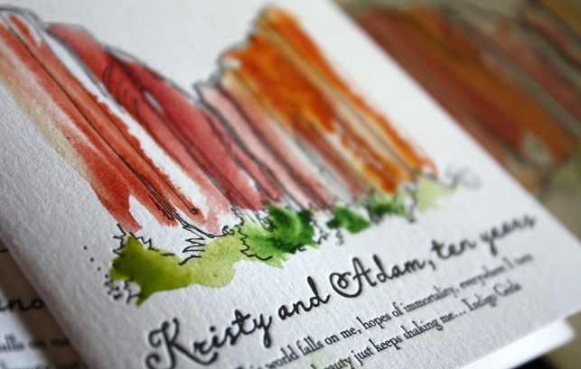
Inspired Ink – A Momental View of Encore Las Vegas
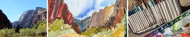
In honor of my quick stop in Vegas this week I thought sharing this fun design created just after my trip to Vegas last October. After spending several days at The Encore, Las Vegas last October, it was difficult not to come home with a head full of inspirations and ideas. I spent one afternoon […]
Press – Momental in Ceremony Magazine
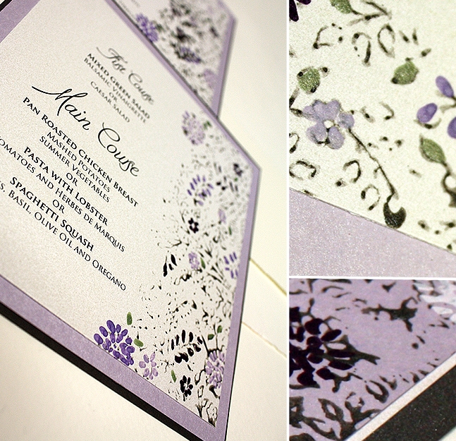
Getting an email from Karen Tran about her next photo shoot project is always a thrill as it is guaranteed to be a exciting experience. Recently our newest Vintage Pattern, lacy leaves, was featured in this “Purple Reigns” shoot exclusively for Ceremony Magazine. The intricate, romantic quality of the pattern was a perfect contrast to […]
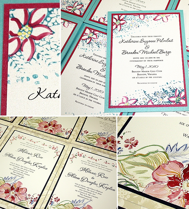
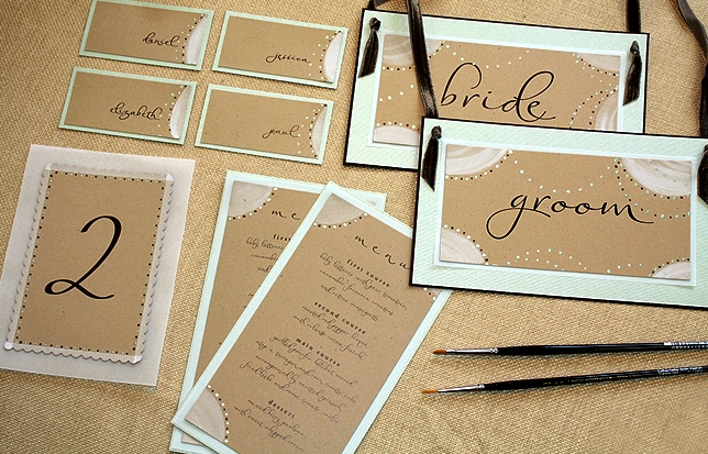
A Peek into the Studio – Blooms, Swirls and Vintage Lace
The studio is buzzing and we are working our tails off here! Jess has been helping me lately with the rush of samples recently and we love her gorgeous landscapes and venue illustrations! Early spring weddings are in full swing and bloom as you can see. Emily’s precious pink dogwoods with hand painted pink and […]
Renewal Inspirations – Green Apple Photography
Yay! We have found our photographer! After a roller coaster ride of a search over the last 5 months the hubby and I have finally found our perfect photographer! Choosing the photographer for our first wedding was a bit different primarily since this was before the wonderful word blog was part of our vocabularies – […]
And the Winner is!
We had an overwhelming 124 entries for the Momental Favorites Giveaway. Thank you to all who took the time to participate and congrats to Devon, our winner!
Press-Elizabeth Messina, Janie Medley, Momental and friends in Bride and Bloom Part II
Today is a look behind the scenes at the stationery pieces created for the Bride and Bloom shoot featuring Elizabeth Messina, Merriment Events and Janie Medley. I mentioned in yesterday’s post that the request was for a non-flower centered design that was clean and unfussy. A look at the collection photographed by yours truly. You […]
Press – Elizabeth Messina, Janie Medley, Momental and friends in Bride and Bloom Part I
Many years ago after meeting a client in Barnes and Noble (before I had a studio outside of my home), I picked up a magazine. The name was Bride and Bloom and I remember being drawn in distinctly because of the watercolor droplets as part of the gorgeous cover. From the first page, I was […]
A Celebration with some Momental Favorites!
What a better reason to host a giveaway, than in celebration, right? As you might know it has been a fabulous two weeks here at The Momental Studio. We are feeling quite blessed and would like to share the love! I have put together a basket full of Momental favorites for the winner of this […]
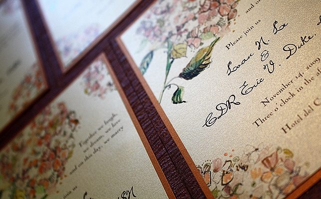
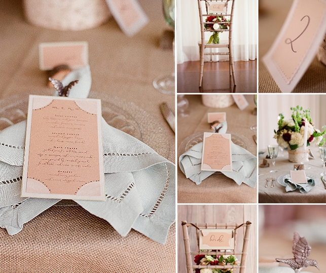
A Real Momental Wedding with Karen Tran Florals
As many of you know, Karen Tran is one of my favorites for inspirational eye candy and floral artistry that makes your mouth drop, quite literally. Karen and I have collaborated on several projects in the last year but finally we were able to share a unique client this past November! Loan (the Bride) came […]